
Last week we chose Jacob Michaels submission to highlight as the COW... wow. That is the first time I have realized why we haven't made this into an acronym.
Anyway. Last week's Creation of the Week is Jacob Laskowski's designs for the new Focus bible study covers. You can see them below.
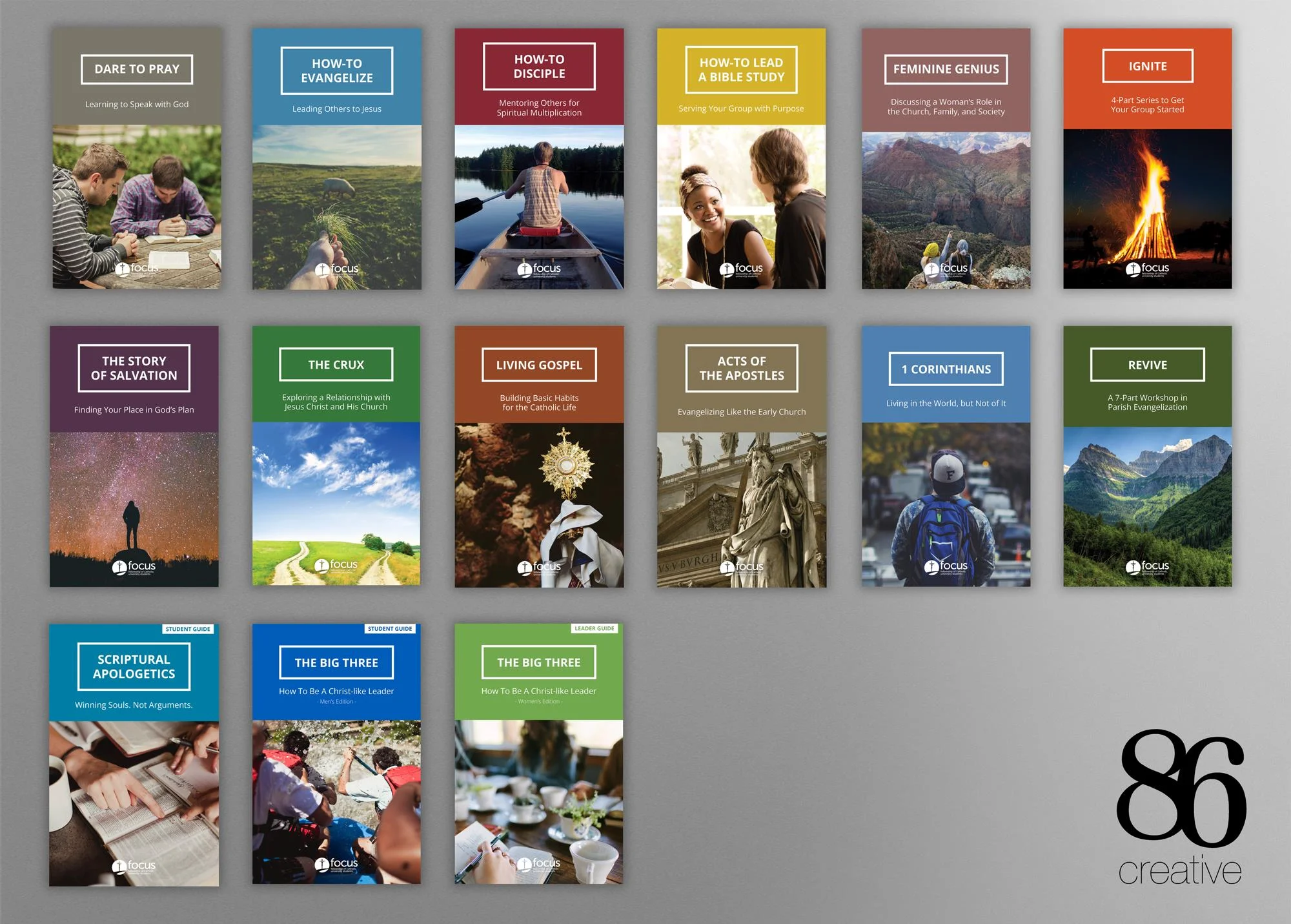
Not only is 86 Creative's agency site super slick (check it out here!) but their design also certainly follows suite. It is not easy to express a consistent brand across fourteen collateral pieces each with their own internal color palettes. In the above bible study designs they have done this incredibly well.
One of the interesting things about design is that usually, when a designer solves the toughest problems, the challenge is simply invisible to the lay man's eyes. This is one such case where the final product simply feels good, but doesn't immediately look particularly elaborate or difficult. It's just some type faces with a header and a square and a picture, right?
WRONG. If an ameture designer had tried to tackle this project, the colors would have fought with each other, creating dissonance, or bled into one another, creating confusion and a lack of distinctness. The fine attention to detail in color palate choice for the set, and then in color palette choice for each individual piece shines through in the final product's cohesive feel. The work in selecting and matching the pictures to those chosen colors reflects the subtle genius behind 86 Creative's design work.
Keep it up guys, and thanks for helping to make the world more beautiful (and colorful).