Creation of the Week

Creation of the Week #8: The Building Blocks

The submissions for last few show off Tuesday's have been rather astounding. It was very difficult to select a winner from last week's post because of how many outstanding pieces there were and because of the wide variety of disciplines/mediums that they represented. Therefore, today's selected creation should not be considered the winner, but simply one creation that is featured because of its relevance to current conversations that have taken place within the group. 

We have selected David Callivetta's "Art Deco Script Font," because it is super cool and nostalgic and interesting. I am not a graphic designer, and I have not studied type in any serious way- but what I do know is that making a good font is hard as hell, and its something that is so subtle that in many ways it is overlooked. 

Graphic Design and (as a particular branch of graphic design) Branding has become a rather notorious topic in the group recently because it is so elementary that it is so often overlooked for more flashy mediums. A really cool font is perhaps less gripping than a really good 2 minute promo video, and so to the untrained eye, the former may never be noticed. Indeed, only the nerdiest of priggish artsy types would look at the wedding invitation with its header written in David Cal's Script, and say "wow that's a really cool art deco font... and the the kearning is fantastic. Look at how balanced the flourishes look on that s."  

No, the person who receives a wedding invitation with the heading typed in this font will get the vague notion that they are being invited to a very posh, vintage, prohibition era party, to which they might be expected to bring their own mason jar and wear suspenders. They will feel privileged to be the recipient of such a selective invite to such an trendy, upper-crust event, and they will see images of how they are dressed, what everyone else looks like, etc.  All this will happen before their mind consciously registers whose wedding this is inviting them to.

The design of a typeface is an incredibly subtle art, where each element is selected like an ingredient by a master chef to conjure nostalgic memories, fantasies, dreams, hopes, and visions, but done in such a way as to make each ingredient invisible and subjected to the experience of the meal as whole. The professional designer thus paints with our own mind's pre-acquired associations- this flourish here, this jaunty angle on the A, the loop under the "m," etc-- to associate the literal words written (dressed in this font) with invisible images; images that are present in our memories. This particular font of David C's does a fantastic job of taping into a our imaginations of the world just after Gatsby & Downton Abby, at the dawn of Mad Men, Prohibition, and book-ended by the World Wars.  

Check out more of his stuff here, and if you feel so compelled, pick a couple up for your designer tool kit.


Creation of the Week #7 American Bible Society's "Pilgrimage App"

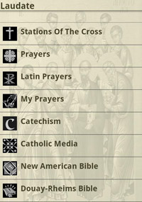
We’ve been waiting for so long, suffering under the yoke of crappy ux, bearing with silent desperation stretched saint pictures, and expectantly yearning for interfaces that don’t look like they were designed by the same secretary that did our bulletins.

Pamela, could you make that Douay-Rheims Bible Icon "Pop" More?

Pamela, could you make that Douay-Rheims Bible Icon "Pop" More?

My friends. That day has finally come.

PILGRIMAGE HAS ARRIVED

Here are the reasons why I've decided to spend valuable phone gigs on a Catholic app:

INTUITIVE INTERFACE

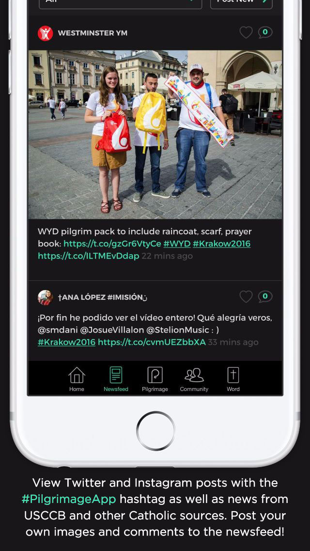
The app has a really awesome interface that reacts to movement and feels on par with all of the other apps on my desktop. *gasp* The photos actually MOVE when you slide your thumb down. The navigation makes sense, almost as if THEY ACTUALLY  TESTED IT! Imagine that. 

VR

I still would have switched Laudate out for Pilgrimage if it hadn't been for this, but not only did this app liberate me from my reliance on Laudate for the daily readings, but it also TOOK CATHOLICISM INTO VIRTUAL REALITY!

World Youth Day closing ceremonies. Holy Mass celebrated by Pope Francis. Broadcast Live in 360˚ Virtual Reality.

I hope that VR will soon be used by Catholic innovators for more than just 360 shots of masses and performances, but this is an amazing start. Imagine what could be done. A LEGIT, LIFE LIKE, 360° PASSION PLAY IN THE HOLY LAND? 

There are not enough caps to express my excitement, so I will continue on.

FEATURES

Pilgrimage gamifies spiritual growth in a great non cheesy way and gives you measurable goals for prayer journaling, gives you great personalized content, and allows you to keep each other accountable in a group. Which, BTW. You want in on the Catholic Creatives Pilgrimage group? Drop our group ID in there (44B) and BOOM, instant accountability.

PRO LANDING PAGE

The landing page for it is on par with any other pro designed landing page and focuses on the selling points with great photography and video (maybe a little cheesy on the voice over, but we’ll forgive them that one small detail.)

The one thing that I just can’t figure out how to line up is that they list the USCCB as a partner. They must have tricked the bishops into approving it by showing them a layout that had the divine mercy image as the background and only used clipart as icons, then switched it out with the awesome version after approval and said “Oh, we can’t change it now!”

Way to go American Bible Society, better to ask for forgiveness than permission, #amiright?

Props to group member Zach Hunter for his work on the project and getting the word out to the group about it.

Creation of the Week #6 Kate Capato's Misericordiae Invitatio

“We believe that the greatest force of evangelization and social change in our world is beauty. We believe that Catholicism is the most beautiful framework for understanding and expressing the human experience... we just need to pursue our craft with excellence. Anything less compromises our passion, erodes our credibility, and dulls the vibrancy of our Catholic vision.”

This week, we have  opted to feature this oil piece by Kate Capato, firstly, because we are deeply proud when any of our members creates with this level of craftmanship, and secondly, it clearly demonstrates the values that we aspire to as a community. Last week, we made a post in the slack channel and in the Facebook group about the purpose of our community- the quote above is an excerpt  from that post. We want to encourage every artist to avoid accepting low standards for their work, but to aspire to nothing short of excellence. Misericordiae Invitatio  is the clearly fruit of such a pursuit of mastery. 

Kate Capato.jpg

I would imagine that it would be very difficult to look at this painting and to not be moved to curiosity, if not awe, at its message.  The combination of a beautifully executed realism with a traditional presentation of sacred art creates an almost fantastic surrealism that allows the symbols speak while also making them accessible. I, for one, very rarely expect religious art to be innovative or relevant. If I am told that I am about to be shown contemporary religious art, I usually grit my teeth and prepare to give disingenuous compliments. This piece, (and others done by other members of the group) has proven that with superb craftmanship and a bit of creativity, an artist can reimagine entire genres of art and breathe life into art  forms which were left for dead in the wake of the modernist aesthetic.

We encourage all artists in this group to pursue their craft with as much love and passion that Kate Kapato did in this painting.

 In the words of the author, "Misericordiae Invitatio: Oil on Canvas. 4.9 ft by 3.2 ft 2016, was recently completed in response to the Year of Mercy and the Theology of The Body messages. The Latin title, Misericordiae Invitatio, translates to Invitation of Mercy. This painting aims at pulling the viewer outside of time."

Creation of the Week #5 Erica Tighe's Calligraphy

I just want to push us right now to all think a little bit more like Erica Tighe.

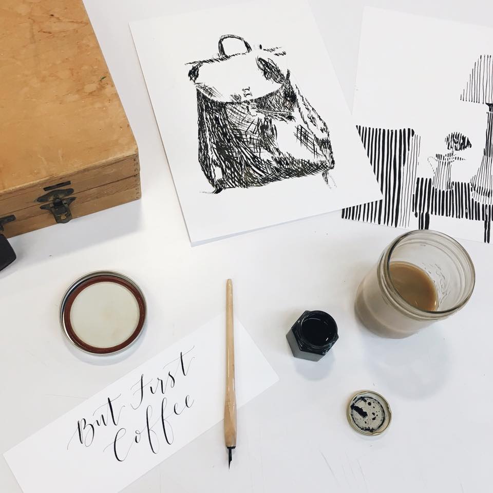
I for one feel the struggle of being in a creative industry and trying to make ends meet. I fall into mental traps all the time. “No one wants to pay for good design, it’s just not valued,” or “I didn’t get started early enough, I never went to school for this…” and other stupid bs like that. While I’m making excuses for myself, struggling to figure out what to do, Erica is over here making things. 

I don’t want to make any assumptions here about Erica’s financial position, but I can say this: Erica has a lot more chances that I’ll give her my money than I have of her returning the favor. Why? Because she’s creating products.

Part of the creative gift is the ability to see things that could be that aren’t, coupled with the willingness to do something about it. Erica is not only one of the people responsible for the amazing visuals for “Blessed is She,” (Client Work) but she has recently put up a calligraphy class on skillshare (Teaching), has an online store with 30 products in it, and just to get at the rest of the 2 percent of us that didn’t already feel like total peons by now, she just released these ridiculously great Catholic Saint Peg Dolls on Envato (Products).

People, there are a lot of ways to make money with our craft, and client work is only one of them. I would love to see the people on this group take a page out of Erica’s calligraphy book and create PRODUCTS with their skills. Good work Erica. Way to inspire us and make us feel totally insufficient at the same time.  

Ps. If you need a store to sell your new products on, www.PetersSquare.com is the new cool hip place to be.

Creation of the Week #2: Daniela's "Wheelock Wildcats Rebrand"

For those of you that have not had the pleasure to meet the illustrious Daniela Madriz, now's the time. Daniela does fantastic work. She really knows her way around illustration and branding, but one of the things that makes her special is her finesse. 
 

Designers don't smile.

Designers don't smile.

Daniela knows that branding is about so much more than designing a killer logo. From the way she discusses money, to how she selects color palates, all the way to how she delivers a brand guide. More on that later.

This is her redesign of the Wheelock Wildcat's logo:

BeforeAfter

Overview

Problem: The curve makes the name difficult to read and gives it a droopy, almost silly feeling.
Solution: The new logo takes the eye from left to right emphasizing movement.

Problem: The old wildcat is hard to discifer. I first thought it was a Chinese dragon. Mascot logos that try to show too much detail usually make the mark more difficult to understand, not less.
Solution:  The new mark is far simpler, relying on the "wildcats" in the name to give the animal its context. 

Problem: Too much detail makes display complicated. The first logo would be incredibly difficult to display on anything but gymn walls and hoodies. Today, logos need to be even more flexible than ever before, from the corner of iphone screens to building inscriptions. For the old mark, that's a problem.
Solution: Daniela's redesign & simplification makes this logo more easily read, more easily understood, and more flexibly displayed.

The Best Part


The best part of this rebrand however, is not the logo, but Daniela's brand guidelines. A logo is only as strong as long as it is used correctly. As it is the last deliverable in the branding processes, it is incredibly easy for designers like myself to burn out and put in a minimal effort on the design guidelines. Daniela, on the other hand, made Wheelock guide for her client that is LITERALLY 62 pages long. 

THE BRAND SYSTEM

If you want to see what attention to detail looks like, click on that link and take a gander. Thanks Daniela. Now the bar is just that much higher for the rest of us.