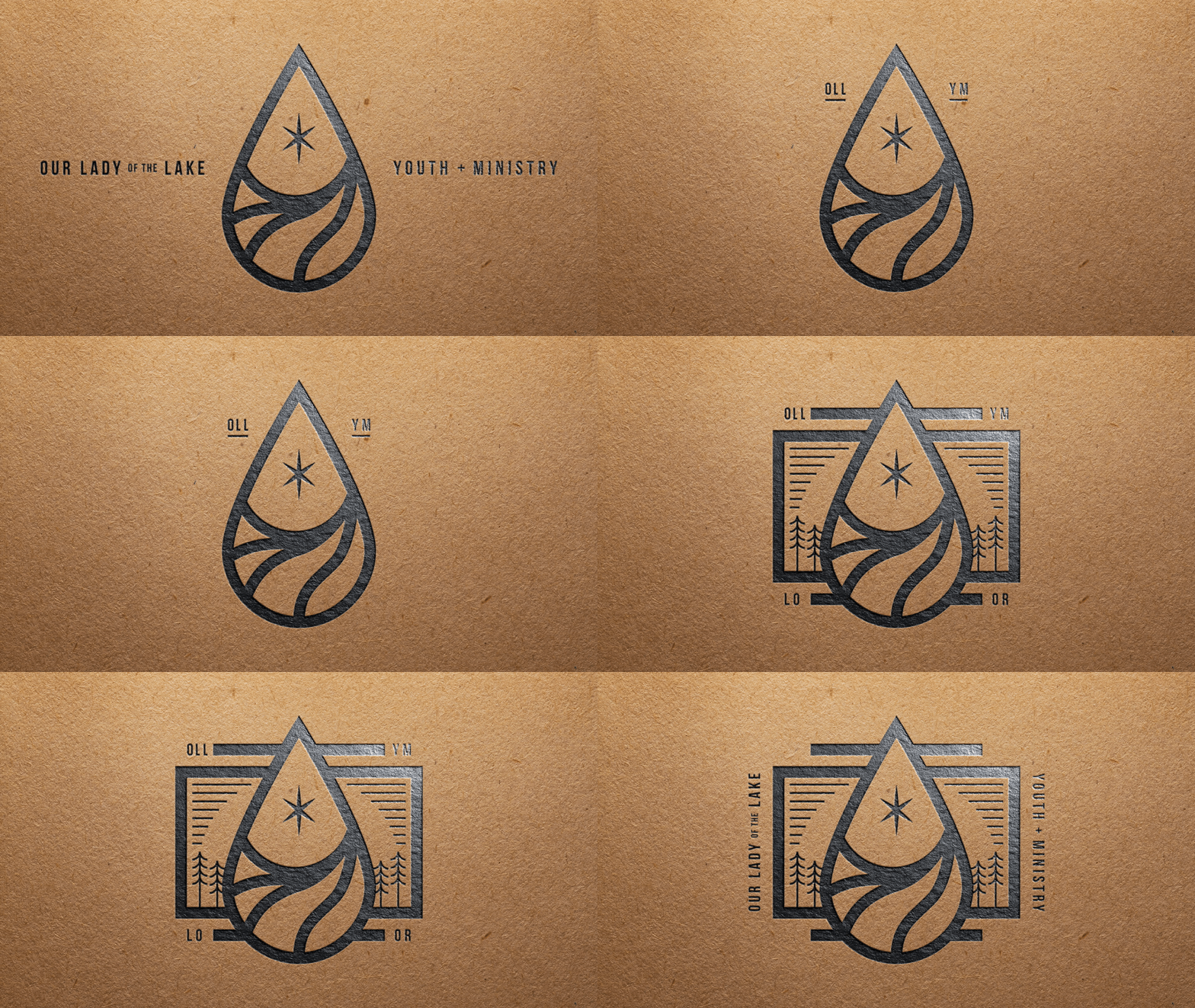
This brand project is amazing, but that's not the only reason why you should read this post. You should read it because the story of how this logo got made is hilarious. But first, let's talk about the project.
The ministry was looking for a new brand that could connect the obvious water theme to the hip woodsy vibe that is the Lake Oswego/Portland area. Let's check out my brand success checklist to see if this brand accomplishes that mission:
1. It needs to reflect your organization’s "why" in a single simple form.
Single simple form: CHECK. The logo is a water droplet with the star of Bethlehem in the middle. This youth ministry leads people to God and does it in style.
2. It must be distinguishable in positive and negative. This necessitates the use of negative space.
CHECK. Aint no weird white space in the crevices. You can see through it. This makes a brand able to inhabit many spaces flexibly and look at home.
3. It must be able to be represented in black and white
CHECK. If you can't recognize your logo's shape after layering over it with white or black, you need a new logo. This logo is SUPER simple, but bold and expressive in its simplicity.
4. It must be distinguishable at the size of a penny, and still look amazing blown up on a billboard
CHECK. This brand looks great at any size. Zoom in and zoom out in your browser and you'll still be able to see the shape and appreciate it.
5. It must last for at least 20 years, but probably more.
CHECK. This brand is going to last a long time. It's not trying too hard, it's not just "trying to make Jesus fashionable. It comes from the heart of what the ministry is about and about the place in which the brand is situated. It says something enduring about the ministry in a flexible way that can be used in many contexts. For these reasons, this brand is going to have some serious staying power.
So now on to the story...
When I told David that I wanted to recognize this project on creation of the week and asked for the files, he sent me back the context in which this boss logo for our Lady of the Lake youth ministry in Lake Oswego, Oregon, was created. Here's what he shared:
Kind of a funny story with this. I'm friends with the new YM who commissioned me to do this branding. Coincidentally, I was also friends with the previous YM who commissioned me to make the ministry a logo about 6 years ago. The new YM had no idea that I made the branding that was in place. When he hit me up to create the new brand he told me that he needed a rush job and that "anything would be better than what they had." I started cracking up because he was ripping on my design AND because he was right, anything would be better than that. (It was a long time ago and I was really just starting out with any sort of logo design. It was decent at best for the era and the stipulations put on me at the time. Excuses, excuses...) So, being the good friend that I am, I egged him on
a little bit and asked to see the current logo. He finally sent it to me saying "It's cringeworthy, probably done on MS Paint." Haha, I lost it. After a few moments humorously bashing the logo I finally let him in on my joke and shamefully owned up to my poor design. I admitted that it was time for a much needed rebrand.
All in all, it was painfully funny to have to come face to face with my old design and someone's gut reaction about it. A good dose of humility. It was also really cool to have a chance to try to redeem my self a bit for it.
David, thank you for sharing such a humbling and hilarious moment for us all to enjoy and take in. If we could all be as humble and committed to honesty with our own work as you are the New Renaissance would be well on its way. Thanks for setting the bar high, both in your craft and also in your humility.
Creation of the Week by Marcellino D'Ambrosio
Cofounder Catholic Creatives


