


We’ve been waiting for so long, suffering under the yoke of crappy ux, bearing with silent desperation stretched saint pictures, and expectantly yearning for interfaces that don’t look like they were designed by the same secretary that did our bulletins.
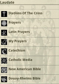
Pamela, could you make that Douay-Rheims Bible Icon "Pop" More?
My friends. That day has finally come.
PILGRIMAGE HAS ARRIVED

Here are the reasons why I've decided to spend valuable phone gigs on a Catholic app:
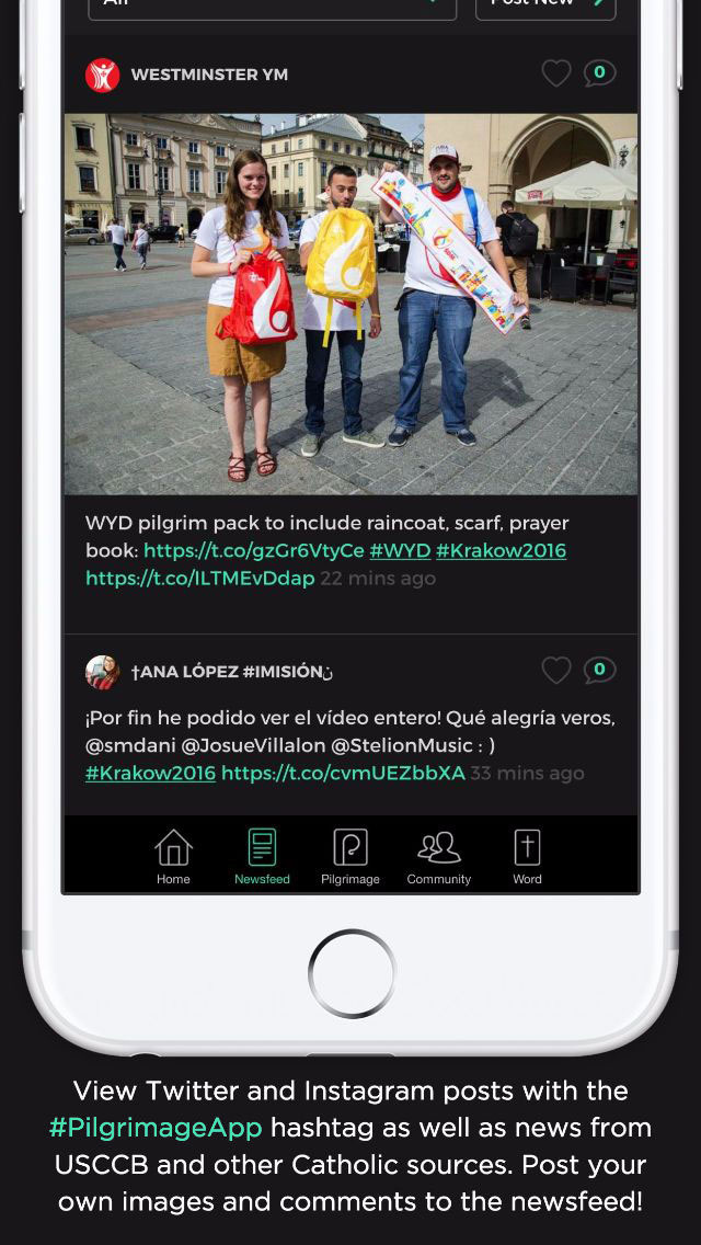
INTUITIVE INTERFACE
The app has a really awesome interface that reacts to movement and feels on par with all of the other apps on my desktop. *gasp* The photos actually MOVE when you slide your thumb down. The navigation makes sense, almost as if THEY ACTUALLY TESTED IT! Imagine that.
VR
I still would have switched Laudate out for Pilgrimage if it hadn't been for this, but not only did this app liberate me from my reliance on Laudate for the daily readings, but it also TOOK CATHOLICISM INTO VIRTUAL REALITY!
I hope that VR will soon be used by Catholic innovators for more than just 360 shots of masses and performances, but this is an amazing start. Imagine what could be done. A LEGIT, LIFE LIKE, 360° PASSION PLAY IN THE HOLY LAND?
There are not enough caps to express my excitement, so I will continue on.
FEATURES
Pilgrimage gamifies spiritual growth in a great non cheesy way and gives you measurable goals for prayer journaling, gives you great personalized content, and allows you to keep each other accountable in a group. Which, BTW. You want in on the Catholic Creatives Pilgrimage group? Drop our group ID in there (44B) and BOOM, instant accountability.
PRO LANDING PAGE
The landing page for it is on par with any other pro designed landing page and focuses on the selling points with great photography and video (maybe a little cheesy on the voice over, but we’ll forgive them that one small detail.)
The one thing that I just can’t figure out how to line up is that they list the USCCB as a partner. They must have tricked the bishops into approving it by showing them a layout that had the divine mercy image as the background and only used clipart as icons, then switched it out with the awesome version after approval and said “Oh, we can’t change it now!”
Way to go American Bible Society, better to ask for forgiveness than permission, #amiright?
Props to group member Zach Hunter for his work on the project and getting the word out to the group about it.