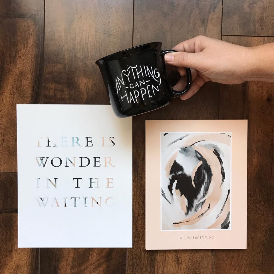
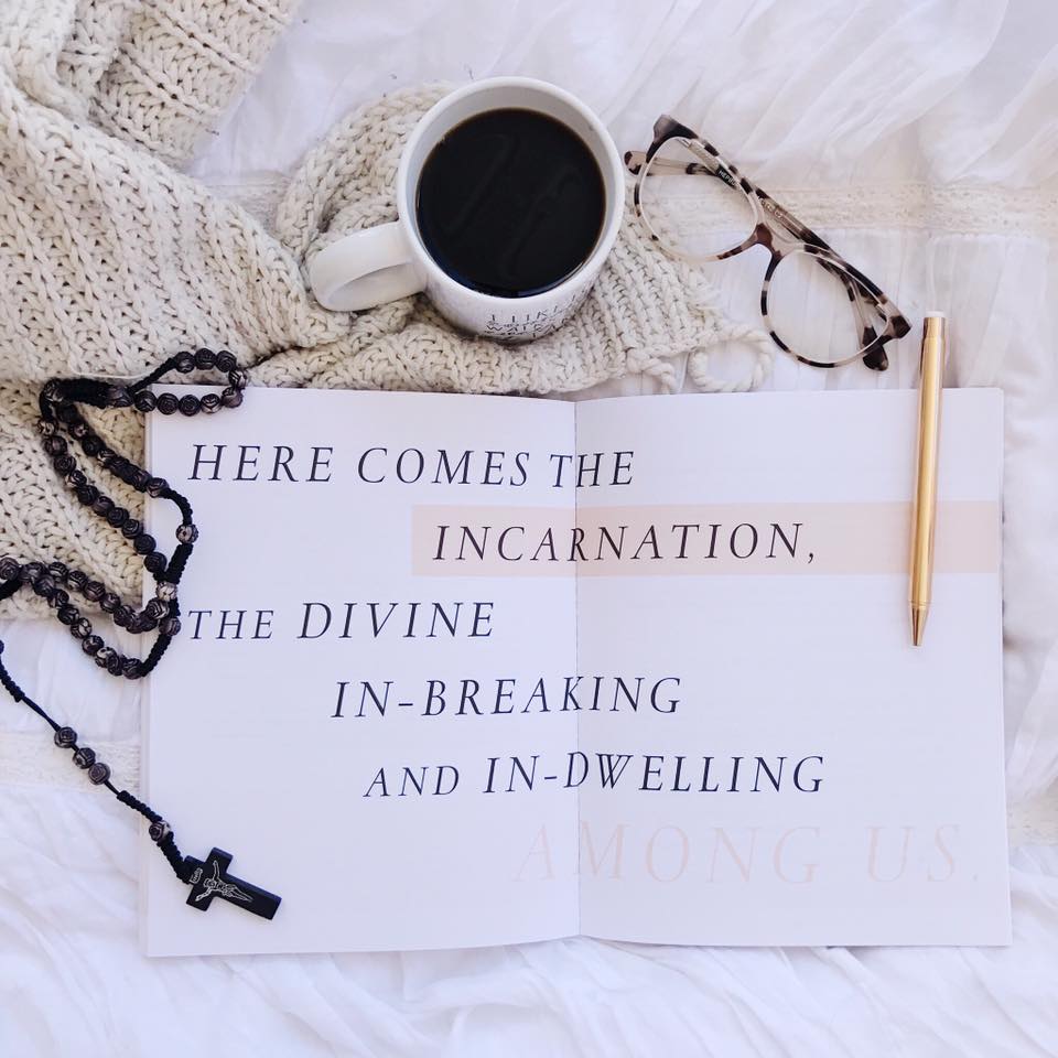
Blessed is She never ceases to amaze me. Those ladies are such incredible pioneers in every non literal way possible. I honestly wouldn’t be surprised if Blessed is She circles got started on mars in the next 10 years. Their Advent calendar this year is another example of how consistently they reinvent themselves and push the boundaries of what they offer to women through their ministry.
Blessed is She is known for beautiful design. Many of us know this. But many organizations that start there find their one look and stick to it for 20 years. That doesn’t work for anyone. First it’s cool, then it’s a fad, then it’s cheesy. It also takes what once gave voice to some deep guttural utterance in the spirit of an artist and turns it into a disembodied commodity. That is how many organizations approach design. Blessed is She embraces the significance of art in a way that so few ministries do. Good art doesn’t subtract from the meaning of its content, but rather it emphasizes that meaning, allows it to breathe, and gives it a dwelling place.
That is exactly what this design does. It's sophisticated, it's fresh, it's alive, and it opens up Advent to the viewer to look at it from a new and different vantage point.
Jenna Guizar led the charge, Laura Fanucci wrote the gospel intros, Erica Tighe designed the calendar and prints, and Katie Haviland Waldow took all of the amazing product shots that show off all the inside details. Every single lady involved in this collaboration deserve special shout-outs for breaking new ground. We're proud of you guys!


