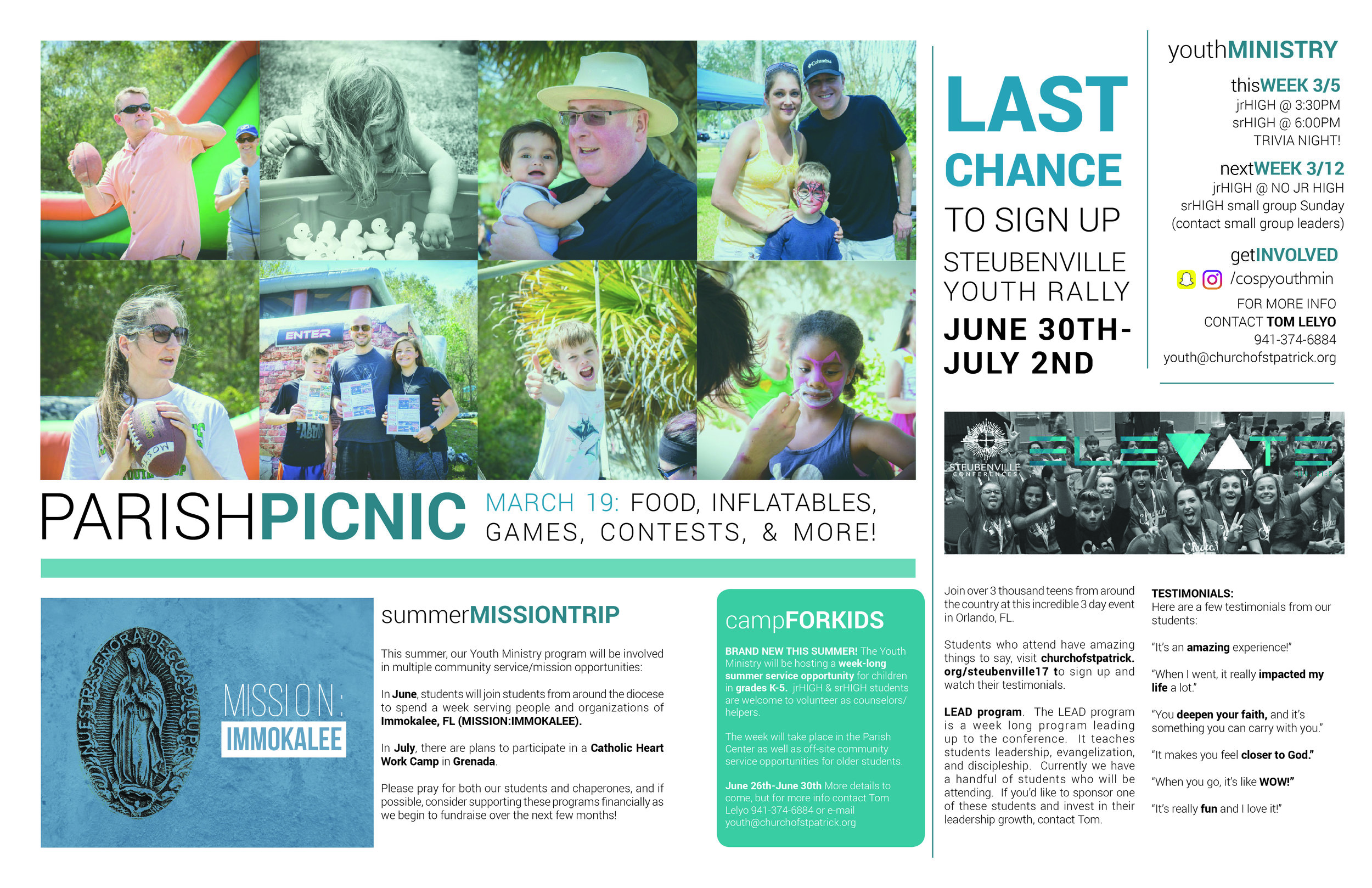
The bulletin is THE primary communication tool at the majority of churches around the world. So, let’s make sure people get the message.
Tip #1 - Make Sure Important Information is Visible
One Sunday, a parishioner fell ill and someone needed to call the ambulance. As someone who was helping him on the phone, that person quickly reached for a bulletin to give the operator the address of the Church, but she couldn’t find it! Luckily, someone overheard what was going on and quickly relayed the information - crisis averted - and we learned to make it really EASY to find our contact information.
- Mass Times - (if space allows) add other devotionals like daily Rosary & Adoration - let people know you have an active prayer life in your parish
- Physical Address, Website, & Contact Information & don’t forget social media
- Staff contact information - add a photo next to each member so people connect a name and a face
Not only do you want important information visible, but you want it to be predictable. Be consistent with the layout & placement of these pieces of information so it’s intuitive for people to find and easy to reference.
Tip #2 - Photos, Not Clip Art
A picture is worth a thousand words. Clip art is worth nothing. Here are 3 tips about the types of photos you’re looking for & how to get them:
- Use photos of people - People don’t care about people’s shoes, socks, or pants - use photos that focus on faces
- Focus on faces - When shooting a photo, make sure the camera focuses on a person’s faces, specifically their eyes
- Composition is Key - Google “rule of thirds” - thank me later ;-)
Make a strategy regarding how you want to display pictures:
- When will you use a landscape vs. portrait orientated photo? (Bulletin cover ALWAYS portrait)
- When will you use a stroke, drop shadow (please... never), or none of the above?
Now THAT's a church picnic photo!
Tip #3 - Better Blurbs
The bulletin is a communication tool. While what you are communicating is important, how you are communicating is equally important as well!
- Use headers to grab people’s attention - use a larger & bold font. Make the caption interesting and attention grabbing
- Copy (fancy word for “blurb text”) should be short & sweet - make your text “sizzle”. People don’t get excited about a date, time, & place. They get excited about stories and people. Tell a story in a few short words about what’s going on and why people should get involved
- Make sure there’s always a call to action - This means you want the reader to DO something after he or she reads the “blurb”. Make it clear what you want them to do, and make it easy for them to do it! (make it better: the web is AWESOME for capturing information about how effective your bulletin is. Use QR Codes, short links, and easy to remember URLs to get people to go to specific pages and be able to track their actions.)
BONUS TIP: THE SPREAD
Did you know that most bulletin publishing companies will allow you to SPREAD across the two center pages of your bulletin? Grab a bulletin, check out the very center, it's not glued, it's simply stapled! That means, it's no big deal for the publisher to let your content bleed across that space. ENJOY THE EXTRA ROOM!
I'd love to continue this conversation with you more! Find me at Tom Lelyo in the CC Facebook group or e-mail me at tom.lelyo@gmail.com
More Inspiration
To see some of my own work on bulletins you can CLICK HERE and check out my flickR album. Most of this work is older, but hopefully still helpful and inspirational for you!
In December 2017, the CC group had a meetup where they discussed Parish Bulletins in depth. To read their in-depth analysis, CLICK HERE.


