Blog

The Amazing Guide Catholic Creatives Regionals

We Believe

We believe that the Holy Spirit is bringing a new Renaissance about in the Church in art, creativity, beauty, and innovation. The Spirit is calling us as a Church to move away from a defensive posture to an offensive one, and in order to do that He’s creating community, infrastructure, and support systems for the leaders, artists, creators, and innovators. Catholic Creatives is a part of that movement.

This Community Needs You

Catholic Creatives need support not just online but real, in-person community. That’s why we are looking for leaders to help host regional CC events. We want to build you up as missionaries to this community and give you the resources you need to be effective in your city, because only out of thriving community can a New renaissance be birthed.  To that end, we’ve compiled some of the lessons we’ve learned over the last year as our community has grown, so we made this guide to give you what you need.

First, let’s start with who we are.

What is Catholic Creatives?

Primarily this group’s primary purpose is to build a support community for creatives. We do that by

  • Supporting and Encouraging each other
  • Fostering Collaboration
  • Encouraging a Culture of Honest Critique
  • Broaching Taboo Topics,
  • Killing Sacred Cows (obstacles to good media/art/business)
  • Giving our members a platform to speak to the larger community.

How do the Regional Events fit into our vision?

CC exists to build a community where artists/makers  & innovators find belonging. That’s why in everything we do, we always take the utmost care in inviting people to our events who match our values and who would contribute to each other. When someone takes on the role of hosting a regional Catholic Creatives event, they essentially become a curator of our regional community. Regional communities are the places we see the greatest ideas, collaborations, and businesses grow out of because proximity matters. Eventually, we would love to see regional groups living together in community, working together in coworking spaces, and building their own economy together. The regional events are beyond important for us as a community, so let’s do them intentionally.

Currently, there are two kinds of CC regional events, the Hangout and the Meetup.
 

Hangout

Happy Hour, informal, 2-3 hour event. Can be at a bar, during a larger event or anywhere alcohol or coffee is readily available. The hangout is a great way to start the ball rolling with a regional community.

Meetup

Half design sprint, half party, the meetup is an awesome half day community builder hosted at an event space or a members house. In a CC Meetup, the leadership selects a problem that the group will brainstorm on. They will lead the group through the design sprint process and after the event, write up a case study on their discoveries.

How to Curate:

When you invite people to into your regional events or into regional online groups, always default to a smaller group of the right people rather than a larger group with too many people mixed in who don't ascribe to our values or beliefs.

So who are the people you’re looking for?

Catholic artists, creators, ministers, & entrepreneurs who express their Catholic worldview through their medium, whether that is a canvas or a business. Look for talent, an entrepreneurial outlook and vulnerability. 

Who is this group not for?

  • Domineering people who take over conversations and don't leave space for others.
    If a person needs a ton of work to host, doesn't understand social cues in a big way, and takes over conversations, they might not be the right person.
  • Self-promoters. This community is only safe if the people in the group are all contributors.

Process:

Host a Hangout

If your city hasn’t had a hangout, start there.

You don’t need our permission to have a hangout, but it would be good to for us to know when you’re doing one so that we can help you and hear how it went after.

Create a private facebook event, use our branding to create any design elements needed, and start inviting people. Know that you will have to reach out to people individually if you want to be successful. A post inside of the CC facebook group is not enough to pull off an event.
 

Host A Meetup

Once a hangout has been successful, let’s set up a google hangout and talk strategy for putting on your first meetup.

A meetup will require the following:

  • A problem to solve or a theme (Ie. The Ugly Church Bulletin, The Vatican Website...etc)
  • A creative space
  • Food & Drink
  • Someone to lead the design sprint
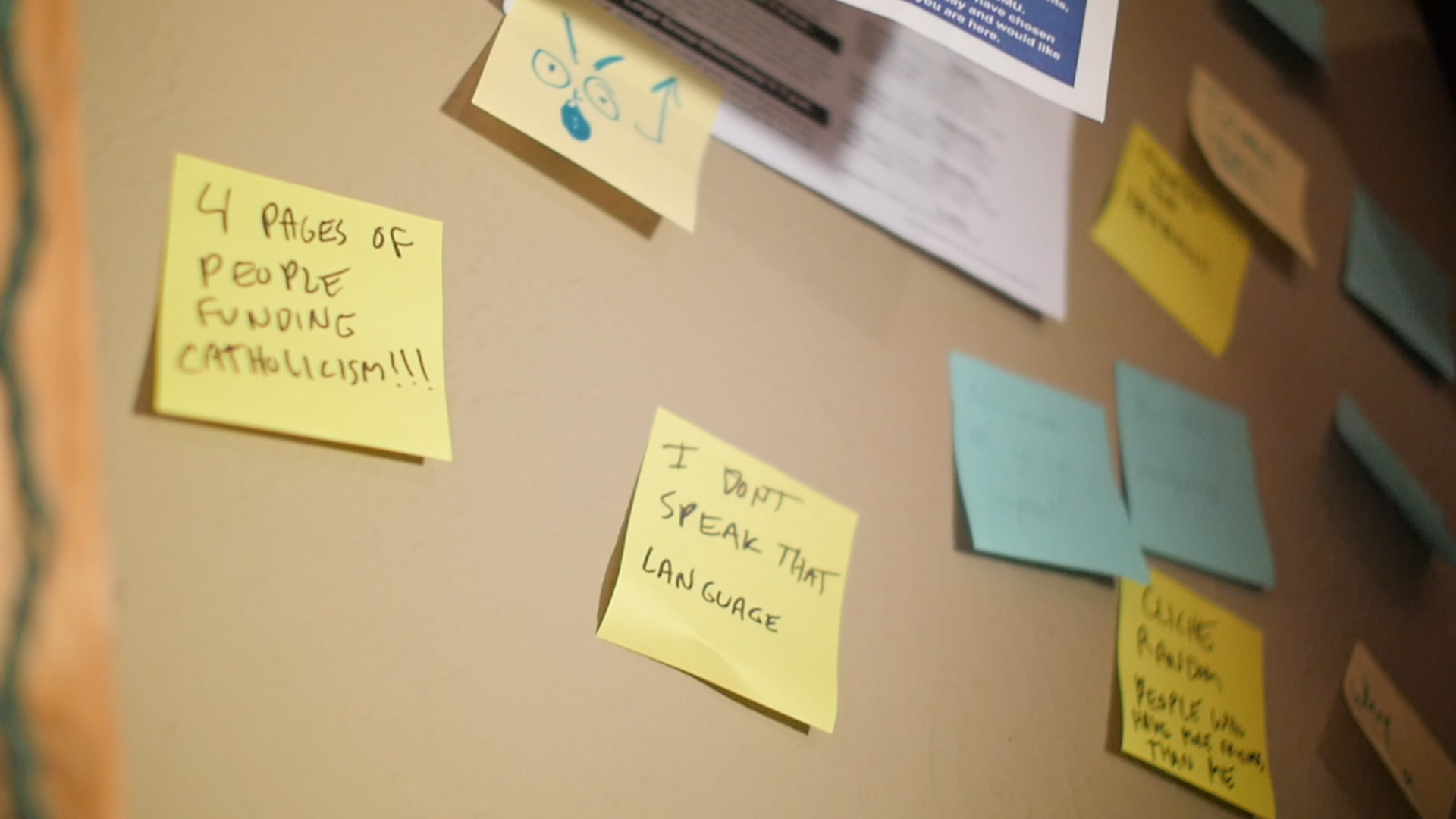
  • Design sprint materials (post-its, sharpies, wall posters)

Meetups are a blast and always lead to a much deeper community than hangouts, but they require more planning. The good news is that we're here to help, so get in touch with us and we’ll help you set it up.

Brand Guidelines

You are welcome to use our fonts and design elements as needed.

Brand Guide

Fonts


Want to get in touch about hosting a regional event?


The CC Community Manifesto

Let's face it. The Church is no longer the great Patroness of the Arts. She doesn't have the same reach and scope she once did at the time of the Renaissance. Yet the world's need for her influence has not lessened over the centuries; if anything, the desire for tangible beauty is greatest now in facing the wave of nominalism coursing through millennial culture. To answer this desperation, the Church needs to blaze new trails for the gospel to pass into the hearts and minds of this new generation. 

This is why the Church needs new DaVincis, Mozarts, Michelangelos, and Beethovens. This is why it needs aesthetically and philosophically articulate creative leaders, artists, and risk-takers: to recast the gospel message as surprising, attractive, beautiful, sublime, and, above all, relevant. The time is ripe for a New Renaissance, a counter-wave of beauty (as an antithesis to nominalism) that can place the gospel back in the center of a cultural dialogue.  

We also need more awesome beards. And hats. Definitely more hats. 

We also need more awesome beards. And hats. Definitely more hats. 

But unfortunately, there are few places within the Church where creatives feel a sense of belonging. For the Catholic creative, the secular artistic community cannot wholly be home; there we are often quietly or not-so-quietly chastised for our archaic religious leanings. And yet, in the church they love, Catholic creatives find themselves again displaced as they recognize the Church’s lack of emphasis on innovation and cultural relevance. Furthermore, the Church’s culture, at least in America, hesitates to embrace the weird, the edgy, the rebellious, or the skeptic, all of which are traits that creatives especially manifest. A blue-haired, inked-up graphic designer feels far less a freak at a sketchy concert venue than walking around a Newman Center. Classics majors, steeped in traditions of philosophy and art, find themselves out of place at parishes where mediocre 70s folk and saccharine preaching are standard. 

Community is essential for creatives. Community is essential for Catholics. Community is essential for human beings. Thus the Catholic Creatives movement was very reasonably formed to assemble all those who affiliate with that trio of demographics. We want to create an open place to collaborate with other individuals like ourselves who pursue the very important work of being creative within, for, or adjacent to the Church.

That is why this movement was sparked, and why creatives from all over the world are gathering in Dallas, March 23rd–26th, to talk about creating a New Renaissance in creativity and culture. For more information, visit www.ccsummit.xyz.

Finally, consider the following:

There is a group that posts the same picture of Jeff Goldblum every day. (It’s called The Same Picture of Jeff Goldblum Every Day because of course it is, this is the internet.) There are Facebook groups for the cute-animal-obsessed, for tracking current events, for lifestyle and health support, for science enthusiasts, and many many many for meme aficionados. Point being, our generation has looked to the digital space more and more to connect with the like minded peers around the world. Our definitions and approach to community have evolved with the dawn of a well-connected global society.
 

But who isn't excited for Jeff's appearance in the next Thor installment. 

But who isn't excited for Jeff's appearance in the next Thor installment. 

So Catholic Creatives has an online community. We have a Facebook group and a Slack channel and an email newsletter and a blog. We have in-person meetups where we brainstorm solutions to issues in the Church. We have a annual summit where we can come together for real human conversations. But all of these are a part of a greater movement taking place in the Church towards a new culture of art, innovation, and creativity. And that's somewhere we can all belong.

Helpful Resources for Stock Photos, Graphics, & Inspiration

We get asked a lot about stock photography, free graphics, and other items. Someday we dream of creative a stock photography site specifically for Catholic stock photos and graphics, but until then here are some resources that many of us in the group use a lot. So, whether you're a professional graphic designer or a volunteer learning on the fly, we all can use a little help & inspiration.

FIRST: Putting it All Together

While being inspired & having great photos is important.  BEFORE you set off on a spirit quest to find all these resources, take time to familiarize yourself with basic communications principles.  There is no better place to do that for church communications than through Brady Shearer at Pro Church Tools.  There's an incredible website, podcast, social media presence and more you need to familiarize yourself with:

https://prochurchtools.com/

Photos:

One Secret Mission

https://www.onesecretmission.com/

One Secret Mission is the Unsplash for Catholic stock photography. It's royalty free, artistic Catholic  stock photography. It's amazing. Use it.

Unsplash

http://unsplash.com/
Royalty Free artistic photography. They have single handily made the internet more beautiful.


Lightstock

www.lightstock.com
Sign up to receive a free photo of the week
Super high quality real-life images


Freely

www.freelyphotos.com
High quality, categorized photos


eCatholic Churches Stock Photos

http://photos.ecatholic.com/gallery/freestockphotos/
Solid generic photos for Catholic Church imagery


Inspiration:

Likable Art

http://www.likableart.com/
Cory is a fantastic Catholic graphic designer.  He can assist you with your project, or you can check out his work to inspire your own.

Church Marketing Sucks Blog

http://www.churchmarketingsucks.com/
Great place for inspiration and ideas on how churches are upping their communications game.


Church Marketing Lab

https://www.flickr.com/groups/cfcc
Samples of other churches' work.  Utilize the search feature to find inspiration for your designs "Advent" "Youth Ministry", etc.  NOTE: Although this group has no longer been moderated, there is a huge archive of designs for you to draw inspiration from!


7ulio.com

http://7ulio.com/
Amazing graphic designer who offers some sweet freebies!

Your favorites?

What are a few of your favorite resources to use for inspiration?  Comment below!

3 Tips for a Better Bulletin

The bulletin is THE primary communication tool at the majority of churches around the world. So, let’s make sure people get the message.

Tip #1 - Make Sure Important Information is Visible

One Sunday, a parishioner fell ill and someone needed to call the ambulance. As someone who was helping him on the phone, that person quickly reached for a bulletin to give the operator the address of the Church, but she couldn’t find it! Luckily, someone overheard what was going on and quickly relayed the information - crisis averted - and we learned to make it really EASY to find our contact information.

  • Mass Times - (if space allows) add other devotionals like daily Rosary & Adoration - let people know you have an active prayer life in your parish
  • Physical Address, Website, & Contact Information & don’t forget social media
  • Staff contact information - add a photo next to each member so people connect a name and a face

Not only do you want important information visible, but you want it to be predictable. Be consistent with the layout & placement of these pieces of information so it’s intuitive for people to find and easy to reference.

tumblr_inline_nc0a3iKloy1sexxg0.jpg

Tip #2 - Photos, Not Clip Art

A picture is worth a thousand words. Clip art is worth nothing. Here are 3 tips about the types of photos you’re looking for & how to get them:

  • Use photos of people - People don’t care about people’s shoes, socks, or pants - use photos that focus on faces
  • Focus on faces - When shooting a photo, make sure the camera focuses on a person’s faces, specifically their eyes
  • Composition is Key - Google “rule of thirds” - thank me later ;-)

Make a strategy regarding how you want to display pictures:

  • When will you use a landscape vs. portrait orientated photo?  (Bulletin cover ALWAYS portrait)
  • When will you use a stroke, drop shadow (please... never), or none of the above?
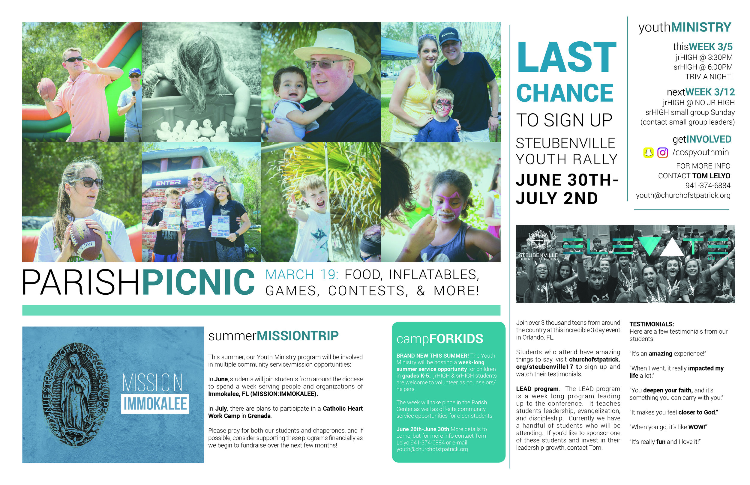
Now THAT's a church picnic photo!

Now THAT's a church picnic photo!

Tip #3 - Better Blurbs

The bulletin is a communication tool. While what you are communicating is important, how you are communicating is equally important as well!

  • Use headers to grab people’s attention - use a larger & bold font. Make the caption interesting and attention grabbing
  • Copy (fancy word for “blurb text”) should be short & sweet - make your text “sizzle”. People don’t get excited about a date, time, & place. They get excited about stories and people. Tell a story in a few short words about what’s going on and why people should get involved
  • Make sure there’s always a call to action - This means you want the reader to DO something after he or she reads the “blurb”. Make it clear what you want them to do, and make it easy for them to do it! (make it better: the web is AWESOME for capturing information about how effective your bulletin is. Use QR Codes, short links, and easy to remember URLs to get people to go to specific pages and be able to track their actions.)

BONUS TIP: THE SPREAD

Did you know that most bulletin publishing companies will allow you to SPREAD across the two center pages of your bulletin?  Grab a bulletin, check out the very center, it's not glued, it's simply stapled!  That means, it's no big deal for the publisher to let your content bleed across that space.  ENJOY THE EXTRA ROOM!

I'd love to continue this conversation with you more!  Find me at Tom Lelyo in the CC Facebook group or e-mail me at tom.lelyo@gmail.com  

More Inspiration

To see some of my own work on bulletins you can CLICK HERE and check out my flickR album.  Most of this work is older, but hopefully still helpful and inspirational for you!

In December 2017, the CC group had a meetup where they discussed Parish Bulletins in depth. To read their in-depth analysis, CLICK HERE.

WHAT ARE SOME OF YOUR OWN TIPS?  DO YOU HAVE EXAMPLES OF GREAT BULLETINS?  POST THEM BELOW!

How to Get More Likes on Your Facebook Page

Written By: Jesse Weiler

Are you running a Facebook page that has plateaued a little in the likes-per-day category? Here is an easy way to get more likes!  

This works for organic posts, boosted posts and targeted ads. I prefer the results that I get through targeted ads, but I'll explain why later. 

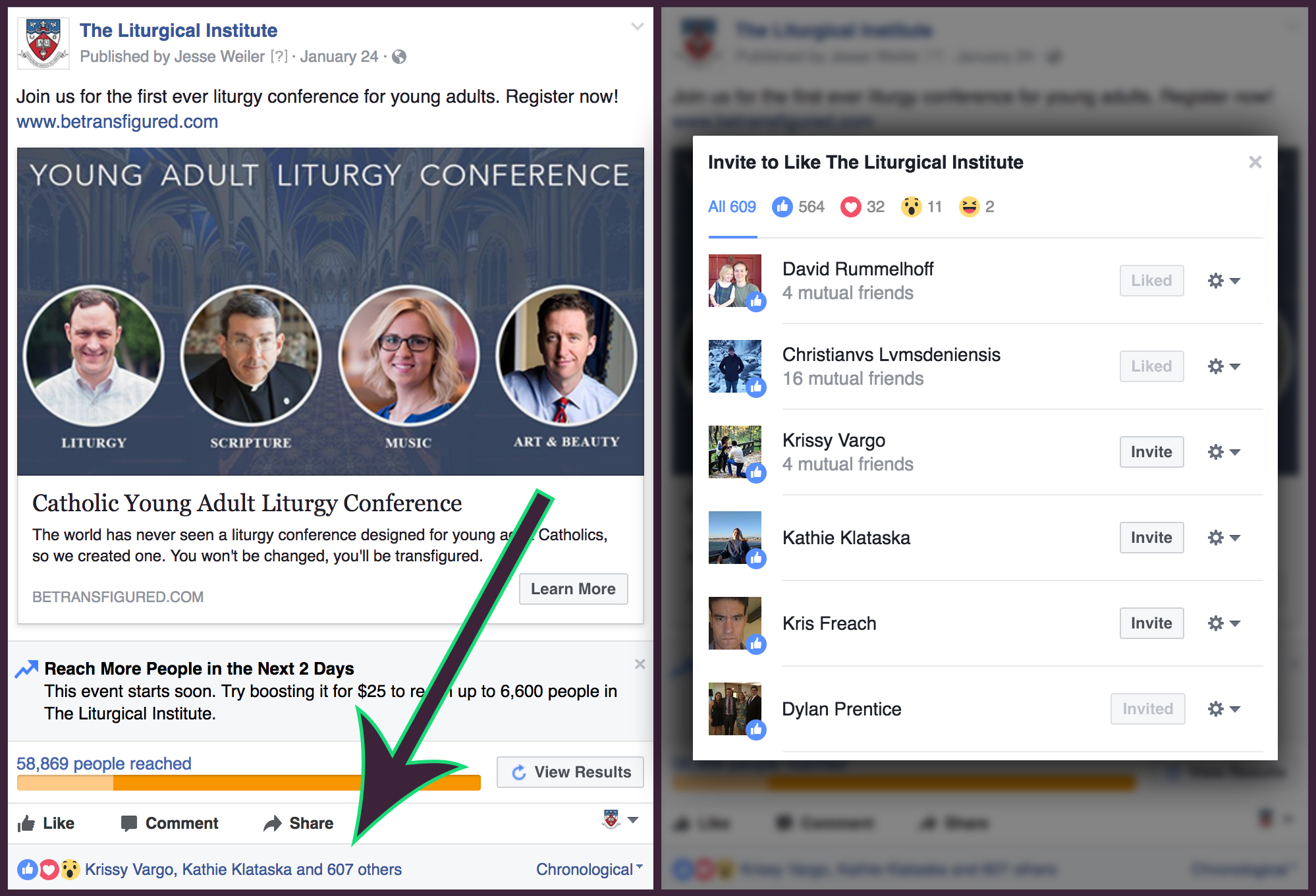
STEP 1: Find a post of yours that has generated a lot of reactions e.g. likes and loves

STEP 2: Click the number that tells you how many likes your post has acquired and a pop-up will appear with all of their names and information as to weather or not they've liked your page. 

STEP 3: Invite that list to like your page. In this case I can invite Krissy, Kathie, and Kris. 

That's it! That's all you need to do.

Notice that some are greyed out with text that either says "Liked" or "Invited". This just lets me know if they already like my page or if I've already invited them to like my page. Facebook does limit the amount of invites you can make per day. I maxed out at about 900 invites on my first day trying this. I was allowed to do a few more the next day. You'll have to keep testing it.  

There is a type of Facebook ad that lets you pay to get likes, but my option is free and just as effective. It has dramatically increased the number of people who follow our page. We saw a 20% increase in followers over the course of one month from 5,000 to 6,000. It was all thanks to this strategy.

I mentioned earlier that I like to use this specifically for ads and here's where it gets good. Whenever I boost a post and use broad audience descriptors, I do get more likes but, they aren't likes that will likely convert. They are people in the Philippines or India that like almost every post/page they see. Those people are not going to come to The Liturgical Institute for a graduate degree. However, if I target an ad to young adult Catholics in America who are interested in graduate school, I will get a higher conversion rate on those acquired likes.

If you use this strategy correctly, you can gain followers that fit your desired demographic without having to break the bank.


Jesse Weiler is the Assistant Director of Media and Communications at The Liturgical Institute.   

Announcing a New Partnership with Gretsch

We are super excited to announce a new partnership with Gretsch Guitars, Crossroads Initiative, & 4pm Media to launch a new initiative geared towards empowering music ministers to build new music programs at their parishes and train young people in the craft of liturgical music. More information on this effort will be forthcoming in the weeks ahead, but for now, if you know a music minister who is attempting to do something unique and awesome with their parish music, get them on our mailing list. This is something they are going to want to stay in the know about.

Our Values

Last week we made a quick video statement for the facebook group as a guide for our future discussions. This is the video:

Catholic Creatives was birthed out of a conversation that started with three entrepreneurs talking over coffee about how crazy it was to meet someone else who shared the same foundations as we did. The three of us had one foot in the ministry world and one foot in the world of media marketing, and a lot of the time felt like outsiders in both. Outside of that, we had a hard time expressing exactly what it was that we believed that was different. Sometimes at an organizations beginning, it's hard to express what its foundations really are at their core, it's all fire and curiosity. Once you start to talk about it and wrestle with it in the day to day, the message begins to emerge. These are ours and they have emerged from all of our conversations with each other since December.

Design Cred: Daniela Madriz. You rock Daniela!

Design Cred: Daniela Madriz. You rock Daniela!

1. Value Art

(Enough to pay for it)

"Art in the Church fundamentally exists for evangelization" - Pope Francis

The Church right now tends to see everything in a mindset of scarcity. We want everything as cheaply and as quickly as possible. We have volunteers do our t-shirts, we pay our daughter $100 to build the website, we have the parish secretary manage the bulletin. This needs to stop. The world's first impressions of the Church are informed primarily by our art. Just as a non believer might enter the Sistine Chapel, inhale awe, and leave with a new impression of God's grandeur, so too should our architecture, bulletins, t-shirts, logos, websites, videos, music and all of our outward facing mediums incarnate Christ. The Sistine Chapel, however, was not done by a volunteer, and it was not turned around "real quick." It took the greatest artist of his time 4 years to paint day and night. 

We need to move from a scarcity mindset to realizing the VALUE of art. If we are ok with being an elitist club for the cultural Catholic, if we are ok with empty churches and cold pews, if we are ok with being thought of by the rest of the world as a joke, by all means, keep having volunteers take care of your media and buying your stations of the cross out of a catalog.

To make meaningful, excellent work, that has the power to transform a community it takes time and it takes skill that has been honed for years of daily practice. Artists must be PAID for their effort in order to develop these skillsets. They do not come from occasional practice on the weekends. How much do secular organizations pay their media teams? Start to invest in art like they invest in art and you will see impact at that scale.  The message of the Gospel is WORTH IT.

2. Art Reflects the Soul

(It's not tricking people into liking stuff)

In most people's vocabularies, design means veneer. It's interior decorating. It's the fabric of the curtains of the sofa. But to me, nothing could be further from the meaning of design. Design is the fundamental soul of a human-made creation that ends up expressing itself in successive outer layers of the product or service." - Steve Jobs

It costs less to slap some paint on top of rotting wood than it takes to buy new beautiful wood and stain it. One is a band-aide, the other is authentic. Good art is always authentic, expressing the inner soul from the inside out. Bad art is lying. Don't ask us to lie, and don't pile in good art with lying. There is a triumphalist attitude in the Catholic Community that says "we are above what those stupid protestants do with all their graphics and lights and smoke, we have the liturgy."  

But isn't the liturgy art? Is it not spiritual, intellectual realities embodied in the physical realm? Is it not poetry?

Jesus harshest words were for the religious: "They tie up heavy burdens, hard to bear, and lay them on the shoulders of others; but they themselves are unwilling to lift a finger to move them" (Mat 23:4). When we tell a teen "Don't have sex before you're married," but don't show that kid the beauty of a chaste life, we are heaping burdens on the shoulders of others without lifting a finger to help them. 

Our triumphant pride needs to be hoisted onto the cross and slain. We are NOT above communications best practices, we are not above production, we are not above beauty. These are the outer layers of our soul as a Church and we must make each and every layer an icon from our Church buildings to our bulletins.

3. Respect the Pro's

(Learn from the people who are doing it) 

"I said, ‘Let days speak, and many years teach wisdom." Job 32:7

The Church in her attempts to reach the lost with media tends to fall prey to two pitfalls in this area.

1.) Putting Resources into Tech Fads instead People

Just as an example, a Parish in it's attempt to update it's communications platform might have heard that parish apps are all the rage and paid a company to develop one, all the while having no one on staff that understands what apps are for and how they are used in the wider public. Professionals who understand communications and marketing are the most valuable resource the Church can have. The only way to tell the difference between a tech fad and the real thing is to have such a person on the team that knows what to look for. 

2. Not Trusting

The Church often tends to go to creatives with a plan already in place, asking for that creative to execute on an existing plan, instead of allowing the creative to influence the plan itself.

For instance, a parish might structure a communications job without consulting ether an IT professional or a Creative Professional, and include IT & Communications in one job description. They might come to a creative for a rebrand with the fonts and color palate already selected. A parish might have an idea for a video that they ask a film maker to shoot for them. All of these situations come from that underlying assumption that art is the veneer. If the Church wants to be beautiful again, attractive again, lovely again, she needs to trust the professional with the process of planning itself, not just the execution. 

Moral of the story for those of us who are looking to usher in the New Evangelization in media: Find someone you can really trust, and let them tell YOU how to go about a given project.

It is wisdom to listen to those who've spent years in the field and know their craft. It is time for the Church to start to listen to those who have dedicated their lives to best practices, not just in the Catholic world, but across the board.

How do We Solve the Young Adult Problem? Give them Post Its.

A year ago, Edmund Mitchell, Anthony (my twin brother) and I started meeting up for breakfast every Monday morning. The food was eggs, the drink was coffee, and the subject matter was putting on a conference that we would actually want to go to. We believed that young adults in the Catholic world don’t need to hear another talk by the same crew of speakers we’ve been listening to since we were in highschool ourselves. We believed that what young adults really want is the opportunity to make an impact. Any event we would want to go to would be highly creative, highly interactive, and must involve a tree’s worth of post it notes. We had no idea where those conversations would lead, but decided to do a meetup in Dallas to test out our theory. When we met powerhouse designer Gaby Thompson and told her about what we were doing, we found that she had been wanting the exact same thing; our team was born. Things started moving quickly, and pretty soon we had a google doc that was 12 pages long with to do lists, talking points, and a shopping list that included Pink Flamingos and purple Christmas Lights.

No joke. This was literally the shopping list in our google doc:

To get:

  • Post its

  • Pink Flamingos

  • Clothes hangers

  • Church Bulletins

  • Pope Francis cut out

    Why Pink Flamingos you ask?

Because nothing says Creative meetup like a lawn full of pink flamingos.

We invited young adults to come to this meetup with the goal of changing the way the Church does bulletins. Admission to the meetup was one ugly bulletin and a 6 pack of beer. The event was so much more awesome than we ever thought it could be. Turns out that as much as young adults love the chance to sit back and listen to enriching talks on the finer points of systematic theology, what they love even more is someone giving them a chance to make an impact.

So many in the Church are seeing the statistics and wondering what can be done. Millennials are all fleeing the Church in droves! We used to be able to at least count on them coming back to mass once their kids need to get into first communion, BUT THIS GENERATION ISN’T GETTING MARRIED! Whatever shall we do, Church?!

What those statistics don’t tell you is that for every 100 millennials jumping ship, one young man or woman is making the choice to leave everything behind to follow Christ. They are joining NET, FOCUS, going to Franciscan, joining the seminary, discerning religious life, and they are coming out of these communities better formed, better educated, and far more committed to their faith than many of their parents were. They’ve come out of these organizations full of passion and starry eyed at the possibilities of changing the world for Jesus. I know this because I was one of these statistical anomalies. Chances are, if you’re reading this blog, you might be one of them too. We’ve all been there. I know I left my alma mater ready to cover some teens in the precious blood of Jesus...


And that’s when were dropped off the cliff into parish life.
Yes. That heavenly place full of felt banners, cheesy jesus pictures, and yes, God incarnate.
I can’t speak for everyone here, but I’ve had so many conversations with creative types about how out of place we feel in the Church. It makes sense, though, right? It’s bad enough when the choir lady with the piercing voice belts out Gather Us In. When you are a son or daughter of the media generation and you’ve spent a few years in the schola or getting your praise on on a daily basis on your NET Team, everything in you is screaming “PLEASE, JUST LET ME DO IT!” The same goes for the hardly designed bulletins and poorly run capital campaigns. Sadly, the opportunities for creative skills in a Church that still uses Papyrus on all of their printed materials has not yet caught up.

But we do have these. Everyone loves these…. right?

It is this generation of on fire young adults that can actually solve the millennial problem. The passion and "lemme at em" mentality is there in buckets. Passion, however, as many of us have already learned, is not enough. We need professional skills that measure up to the standards of the secular world. We need wisdom in navigating the political hierarchy and the frustrations that come with Catholic organizations. Most of all, we need advocates in the broader Catholic community to advocate for better media. This community of Catholic Creatives is meant to serve in all three regards. In sharing and charitably critiquing each other's work, we hope to set the standard for Catholic media high. In putting younger creatives in touch with those who are more experienced in navigating the politics, we hope that the usual landmines can be avoided. Finally, by giving Catholic creatives a neutral, unified voice, we can create a platform from which we can influence the Church on a large scale.

Make no mistake, impact is what this generation wants more than anything else. If I hadn’t seen that at our December meetup, I would know from the hundreds of conversations I’ve had with like minded young men and women. We are, as our facebook bio says: “makers, thinkers, and do-ers. Those who want to use their gifts for a higher purpose, bring beauty back to the Church.” This generation, though sometimes over confident, though sometimes, perhaps, unaware of the complexities of the Church’s inner workings, by the grace of God can reverse the hemorrhage and make the gospel message resound across our nation.

I’ll close with this: I don’t know what Catholic Creatives is going to be. None of us do. It will be shaped by the ideas, conversations, and efforts of those of us who need what this community is and could become. We really want to get to know you and your needs, your wants, and your ideas.

Sign up for our email newsletter, get involved in the facebook group, or better yet, email us and let us know how you think you can help shape our online community, our meetups, and eventually our conference. We can’t do this without your needs and ideas. 


Marcellino D'Ambrosio started designing fliers for his band in High School. He is an expert water balloon filler, a veteran dodgeball player, and a slightly above average joke teller. He helps run The Crossroads Pursuit, and is a founder at D'Ambrosio Creative.


The Bulletin Problem: An In Depth Analysis

In December, 2015, Catholic creatives from all across the United States, each from different industries, gathered together to solve the bulletin problem. Here are the insights and conclusions that they gathered. To find out more about the meet up and the brainstorming processes that they took to generate these insights, click >here<.

I. Ask “Why?”

A bulletin is a part of a communications strategy, but before you can even talk about whether or not that communications strategy is effective, you need to ask why your parish is communicating in the first place. Why does your parish exist?

If you answered “to bring people to Jesus,” again, ask “why.” When you’ve answered that, ask why again. Don’t stop asking “why” until you’ve been able to gather around a vulnerable cause that moves you.

Learn more about why asking why is important: Start With Why Ted Talk

II. Ask “Why the bulletin?”

Once you know what your message is, ask “why a bulletin,” why does the bulletin exist? Most bulletins suffer from a severe split personality disorder.

  • Often times the bulletin includes every detail of parish life, from Tuesday’s prayer shawl knitting group to the pancake breakfast next month.

  • Tucked between these calendar updates, however, is Father Don’s short meditation on the gospel.

  • Before the ads, there’s a half page story of how the youth group went on a mission trip and built a house for a family in need.

These are three separate purposes.

  • Is the bulletin an event calendar meant to inform parishioners of the parish’s activities?

  • Is it meant to be a method by which parishioners are fed spiritually?

  • Is it meant to be a way for visitors and parishioners to connect with the rest of the parish by seeing faces and reading stories?


Ultimately, through discussion, the Creatives at the meetup decided that the bulletin should be focused on the latter.

The Bulletin Should Be Outreach, Not Updates

We decided this because it is far easier and more effective to keep parishioners updated about parish events via other communication methods such as an email newsletter, social media, a parish app, and the parish website. Furthermore, there are already plenty of resources for spiritual growth that parishioners can be turned on to. For example, Word on Fire, Crossroads Initiative, or Dynamic Catholic are great. Finally, the only audience in your parishes that you cannot send these resources to through other outlets is the group of people who are not already involved in your church.

What we concluded, then, was that the most efficient use and purpose of the bulletin is to connect new people-- specifically, visitors or those who are on the fringes-- into the life of the parish.

background.jpg

III. The Three Principles for Effective Bulletin Outreach

 Here are the standards to which a bulletin should be designed in order to most effectively connect new and fringe parishioners into the life of the parish:  

1. Local

In order to connect people into the life of the church, the church must have a life of its own, and it must be willing to feature that life in a personal way. This means it must feature pictures and stories of its people living and acting Christian community. If you don’t get any of the rest of these right, you can still have a very effective product if you get this first principle down.

To be connective tissue between the parish life and visitors, the bulletin has to be absolutely local to the parish community. This does NOT mean that it should be filled with pictures of the church building. We want people connected to the life of the parish, not its bricks or its crucifix or its statue of Mary in the courtyard outside. To be local, it needs to tell the stories of members.

For instance, think of the kind old usher who is there at the 9:30 am mass every week-- that greeted the visitors when they came in-- has a story. The bulletin should contain the stories of parishioners who are living out the faith. It should personalize the pastor, and contain the pictures and names of parishioners. One Catholic Creative at the meetup kept repeating the mantra: “Names, names names.”

WHERE WE WENT WRONG

Most of our bulletins, however, are the furthest thing from local. Most of them look indistinguishable from one parish in Pensacola to another in Columbus Ohio. This is because most parishes are using a bulletin printing company to get their bulletins printed for free in exchange for the adds in the back. If you are currently using one of these companies, our meetup suggested rethinking that business relationship, or at least taking control of all design in house. These companies' value offer is free printing, but they are not experts on design or on contemporary communications. Some members of the meetup questioned if the exchange is really worth the money saved, saying that it would be better to not have the bulletin then to give visitors something ugly and impersonal.
 

2. Beautiful
 

Beautiful design is far more about structuring information than picking the right fonts or getting the right margin. Good design is more a function of cutting away unnecessary information and clutter than anything else. Only the information that is absolutely necessary for executing the purpose stated above should be included. Everything else should be communicated with other mediums (email newsletter, social media...etc), or simplified and relegated to a place of lesser prominence.

Once that has been done, here are some guiding principles for good design:

  • Speaking of clutter, don’t be afraid of white space. Let whitespace happen. Embrace it.

  • Pick two fonts. One sans Serif, and one Serif. If you don’t know what Serif or Sans serif means, then pick ONE font. To give the text visual hierarchy vary the size and utilize the bold, all caps, and italics that font has available in its “family.”

  • Let visuals and pictures tell the story. Pictures are worth much more than your text. Put the detailed text on the website or in the email.

3. Meaningful

The dates of your events, the times of your sacraments, and even the stories of of your parishioners will not be read and retained if the reader doesn’t know why they are important. Again, you need to know your “Why,” your mission; and that mission needs to be specific to your parish. If this is done well, then every piece of information that you place on your bulletin must be chosen in order to draw people into your parishes “why.”  With that in mind:

  • Meaningful communication is linear.
    It starts with an introduction, develops into a body, and then closes with some sort of call to action. Each section of the bulletin should move the reader deeper into your why and lead them towards some action step.The sections, then, should make sense, not just on their own but in relation to each other.  

IV. OBSTACLES TO GOOD BULLETINS

This conclusion list would not be complete if we did not acknowledge the challenges that any parish faces in making changes to their communications strategy. This is by no means a comprehensive list, but we believe these are the two greatest challenges to a local, beautiful, and meaningful designed bulletin.

1) Many churches do not have anyone in charge of any of communications or anyone with the technological training to understand them.

If someone is in charge of designing the bulletin or updating the website, the odds are that they are also in charge of booking rooms, answering phone calls, and managing Fr’s calendar. They are most likely not trained in digital communications; wordpress and flocknote are most likely uncomfortable to them, and they are mostly designing on microsoft publisher. Facebook is probably the last thing that they want to think about. In order to really change the bulletin, these other mediums of communication need to be given time and consistent effort. Most parish offices need to be reorganized such that the job descriptions and titles make more sense. The administrative assistant should not be in charge of designing bulletins, and the communications director should not be in charge of taking care of all of the parish’s IT- i.e. if the server goes down, call some one who fixes those professionally. The right people need to be hired and given the resources and support they need to make the changes that they need to make in order for truly effective communication to take root.

2) Many parishes are incapable of managing complaints

Selecting an audience and a purpose for the bulletin means simplifying, reordering, and hewing off information that is not relevant to the audience which you have selected. In short, it means excluding some information that some people want to be included. In parish life, complaints tend to grind any change to an immediate halt. When you stop using the bulletin as an event calendar, there will certainly be parishioners who will not be happy with the change.

In order for any significant progress to be made with the parish bulletin part of the strategy for its implementation must include a plan to communicate the reasons behind the changes to the parish. Perhaps a strategic move to stave off favoritism complaints would be to totally do away with the bulletin all together and then to re-institute the new communications tool later. However, whatever happens, the decision makers & staff have to be prepared to hold their ground when parishioners complain.

In conclusion, the most important issue with bulletin design is not the clipart or bad font selections, but it is the lack of intentional purpose behind church communications. This is a systemic problem that needs to be fixed in the staff of a parish before the bad bulletin problem can be clearly addressed. However, for parishes who are ready to use the bulletin effectively, we hope that the principles outlined above -namely, local, beautiful, and meaningful, can act as a helpful guide for a new compelling approach to bulletins.