Creation of the Week #23 Josef Lang the "Stowaway"

You know what's one design challenge that I would never want to take? Reinvent the chair. That is a design challenge for someone special, and that someone is Josef Lang, which I might add, is the perfect name for a person who makes things like this:

That, my friends, is the chair reinvented. Joseph is an engineer, designer, carpenter, and maker in all senses of the word. Just check out this guy's workspace:

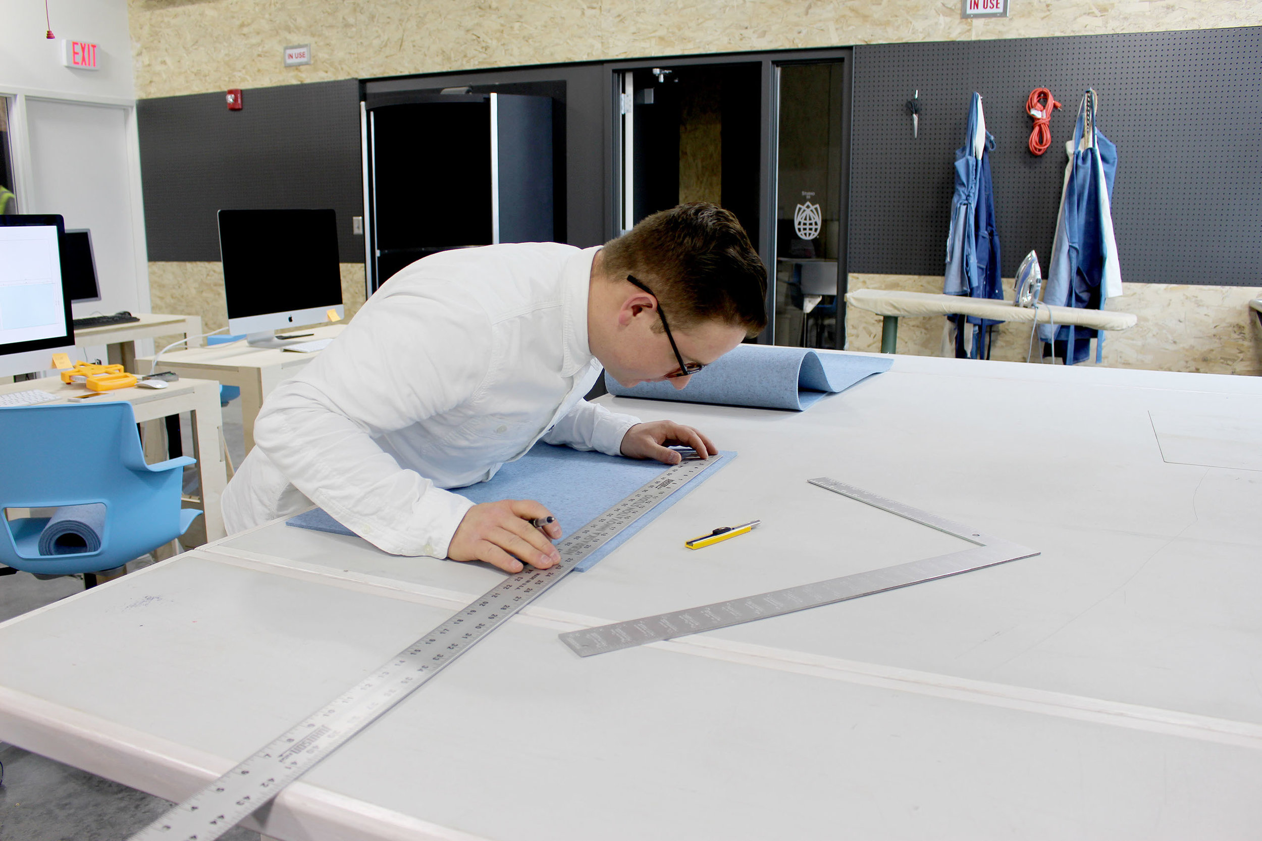
After commandeering his local apple store and turning it into his personal workshop, Josef decided to make this folding chair that literally folds into a square. It's as beautiful as it is practical. I've never seen anything like it. According to his website, "Stowaway is a collapsible felt and wood stool that zips into place for easy assembly." So not only did he redesign the chair, he finally gave felt a real purpose. There has been no comment as of yet on whether or not he would be making his next prototype out of the felt banners from my home parish, but we're all crossing our fingers. 

Another thing I love about Josef is how committed he is to beautiful presentation. This is a lesson every artist that's ever seen one of their paintings encased in a faux metal frame: Presentation can make or break your art. From his website to his Mockups, Josef's presentation is spectacular.

Sadly, the product is still in development, but as soon as it is available for purchase, we will let you know. Josef, it is an honor to have you in the community. The only question we have for you, Josef, is:  did you decide to take up making because your name is Joseph or is your name Josef because you were always going to take up making? ...

Creation(s) of the Week #22 Everyone's A Winner

Last Week there was so much amazingness shared I had to at least give you a few highlights. 

1. One Solitary Life

Cory Heimann and the rest of the people at Likeable art produce amazing work with a consistency that is unrivaled. Every piece I see from them is so uniquely thought up and comes from such an individual origin that I haven't been able to identify a "Likeable Art style" other than the fact that I cry every time one of their videos draws me into it's world. That's why I'm so excited to hear from Cory at the Summit in March and learn some of the tools they use for creative brainstorming. 

2. Daniela Madriz' Logo Design Skillshare Class

If you have not already seen Daniela's work, she's amazing. I've had the privilege of working with her on multiple projects and she's always done an incredible job from communication to concepting to design. If you have ever had an interest in branding or logo design, take her class. It's one of the best on the topic on skillshare. It's very well done. The videos are high quality, she's a great teacher, and the content is awesome. Within two weeks, she has over 200 people enrolled and paying for her class. 

3. Jacob Machado's  "Questions with Martin."

This is such an incredibly unique take on the usual musty capital campaign video. This is a great example of how a production budget doesn't need to be insane to get a piece that will resonate. 

4. Alexander Johnnides's Crowning of the Bride

Alexander Johnnides won Rangefinder Magazine's photo of the day for this shot and it's not hard to see why. The drama expressed within it is nothing short of mesmerizing. It often occurs to me how difficult it is to capture emotion with photography. You have one image to tell a story. There's no background music, no narration, no context, and yet a good photographer can speak all that is necessary. Well told, Alex.

5. Dan Rogers: "Together, Let us Go Forth"

Everything about this production bleeds excellence. The visuals, the titles, the music, the script... each executed with the attention to detail, the careful mastery, the attention of a seasoned professional. 

6. David Calavitta's Fire Inside

Handlettering is a field that seems to be dominated by flowery script, which while beautiful, is not always what is needed. However, to be able to adopt many alphabets and types of letting is an incredibly difficult feat to accomplish. David is absolutely flexible, always choosing the right letter forms for the setting. Here, for a men's book, blackletter was the right choice. Rough, textured, the letters almost look chard. He integrates his type into his designs with an adeptness that defies description.

4pm Media's St. Michael Catholic

I love how fast the pace is of this video. It get's a LOT done in 60 seconds. According to Jonathon, they only took one day to shoot and one day to edit. It is sometimes a huge pain to force yourself into time constraints, but that's often where the magic happens. Great work, 4pm.


Creation of the Week #21 "Pascal Jude" By Max and Audrey Haben

There is something so incredibly powerful about what happens when people share their most vulnerable, human moments. The Haben's shared their experience of bringing Pascal Jude into the world in beautiful honesty. I have not seen a more moving piece piece in a long time. Thank you so much, Max & Aubrey for the witness that you shared with us. You guys are amazing. What a testament to love, marriage, and life.

Creation of the Week #20 Mike Mangione's "Three Days"

"And to surrender is to win, to welcome death is to begin.
To be the words they speak of, to hold my weakness that's the love."

Mike Mangione's music is fantastic. He's a powerful entertainer with a bright mind and an open heart. I had the opportunity to witness him perform recently and it was awesome. He was raw and as authentic of a performer as I've seen. That same authenticity that's a hallmark of his songwriting and performance is very much present in "Three Days." It's a song of expectation, you get the feeling you're exploring some wild landscape as you listen.  The lyrics capture's the hero's journey, from the Call to Crossing the Threshold, to the Ordeal and the Resurrection. If you don't know what I'm talking about, do yourself a favor and read about the Hero's Journey. It'll make all your art better. 

Mike uses Catholic imagery the way that Flannery O'Connor did. It's always unexpected, sometimes shocking. Three Days is deeply Catholic. In a way, you follow Christ through his experience of ministry. The song beings with a young adolescent that must be about his fathers work, eager to begin. It moves to uneasiness, at the poor's "hatred in disguise," and ends with an embrace of death and weakness. In a way, the song put me in touch with the humanity of Christ, especially in the discovery of the crowd's fickle nature. Though I wish more did, not many artists make me feel that side of Christ and the Christian life like Mike does; the dirty, gray, human side that we so often are afraid to hold.  

That's why I'm really excited to get Mike's EP when it comes out. In the meantime, I'll be  listening to  his music here. 

For those of you that haven't listened to Mike's Podcast, "The Time & The Mystery," I'm going to include one of my favorite episodes here. His interview with Bishop Donald Hying is profound. Enjoy!
 

Jonathan did a great job from concept to shooting to editing. Everything about this video is 100% professional. The music is refreshingly youthful, the cutting is smooth, and it feels like the kind of thing that any modern advocacy organization would produce. I’m proud of everyone involved in this effort for helping to set a new standard for diocesan use of media. The one thing I wish I could ask Jonathan is how he got all 7 bishops in the same place at the same time.

give a solid shout out to MCC as well. Not only did they invest well in the right talent with Jonathan on the video, but they also have a great social media presence and an acceptably designed website by which they can actually get real value out of the video’s reach, which is currently sitting at 54k views. Not bad, MCC, not bad at all.

A lot of organizations look at video as a quick flashy thing that’ll get them donations, attention, or awareness quickly.  I’ve had prospective clients approach me willing to drop 10-20k on a video, but be un-willing to spend anything to update their website and logo that were done in the 90’s.

Media is the same as anything else in life. There’s no quick fix.

You can only get as much milage out of a video as you have the infrastructure to support it, and Minnesota Catholic Conference clearly does. I’d love to see more Catholic organizations invest deep enough in their media that they can invest wide effectively as well.

Great work, Jonathan! 

Creation of the Week #13 Fabi & Marie "Unveil the Wonder"

This week I’m pumped to get to feature two ladies who have been posting incredible work consistently in the group, Fabiola Garza and Marie Heimann. It’s always so encouraging to see collaborations like this happening in the community. Check this OUT:

This will be a cover illustration for Likable Art's upcoming book that we are probably all not going to want to wait for after seeing this cover. 

What is so amazing about this? The illustration is whimsical, nostalgic, playful, capturing our inner child. Everything about this image displays visibly the spirit of “wonder,” a word that reminds me of who I am and what kind of God I fell in love with as a kid.

There is so much to love about this image. These are a few that struck me:

1. The Use of Scale

The subject, a little girl in a pose of pure amazement is tiny in comparison to everything else in the image. The door, the guards and the trees around her are all about 3 times her size. This use of scale immediately returns me to the experiences of wonder I’ve had in my life, of being small before the immensity of a mountain or a massive sky full of stars.

2. The Use of Light.

The contrast between the soft blue night and the vibrant light inside the door is so mystical. It draws the viewer into this deep curiosity. What’s on the other side of the door? I NEED TO KNOW!

But seriously, Fabi, please tell me.

3. The Handlettering

The image is completed by the handlettering. It is often very difficult to add type to an image like this one, but the lettering not only fits, but adds a further whimsical expressive beauty that invites the viewer to a further reminder of the deep yearning that we all had as kids.

A Yearning for Heaven

This image ultimately reminds me of the doorway at the end of The Last Battle in the Chronicles of Narnia, the door from one world to the next. Lewis was the first one to connect my deep yearning for wonder to the desire for heaven. This image does that for me. It tells me that this world is just a shadow of something great and magical that is to come.
 

Keep up the good work Marie, Fabi. You’re amazing.

“These things which are a mere shadow of what is to come; but the substance belongs to Christ.” Colossians 2:13:

Previous Creations of the Week:

Creation of the Week #12 - "Venerable Fulton Sheen" Cassie Pease

Cassie Pease is an incredible designer. She really knows how to bring a Catholic saint alive with her desktop wallpapers, and this week I really was struck by this image of Venerable Fulton Sheen. 

Cassie has beautifully distinct style. She is obviously informed by pop culture, but departs from it in some very potent ways. She essues minimalism, with the grungy textured background, she uses drop shadow and glow effects on her text which most designers have long since written off, and favors vibrant colors rather than desaturated tones. I don't know whether Cassie is breaking the rules on purpose or if she simply developed her distinctiveness in a more organic way, but it is beautiful. 

She also does an amazing job choosing the right photos and editing them to fit her vision. I did a quick google search on images of Fulton Sheen and found the photo she used. It was the only half descent pic of him I could find, and it was only 480px wide.

With her Walpapers, Cassie often has to work with bad photos or old paintings/statues.  She is masterful at using these less than ideal building blocks and helping us to see these saints in an altogether different light. I'm looking forward to downloading the next wallpaper, Cassie!

Find more of her work here: http://cassiepeasedesigns.com/

Creation of the Week #11 - 86 Creative - Bible Study Covers

Last week we chose Jacob Michaels submission to highlight as the COW... wow. That is the first time I have realized why we haven't made this into an acronym.

Anyway. Last week's Creation of the Week is Jacob Laskowski's designs for the new Focus bible study covers. You can see them below.

Not only is 86 Creative's agency site super slick (check it out here!) but their design also certainly follows suite. It is not easy to express a consistent brand across fourteen collateral pieces each with their own internal color palettes. In the above bible study designs they have done this incredibly well.

One of the interesting things about design is that usually, when a designer solves the toughest problems, the challenge is simply invisible to the lay man's eyes. This is one such case where the final product simply feels good, but doesn't immediately look particularly elaborate or difficult. It's just some type faces with a header and a square and a picture, right?


WRONG. If an ameture designer had tried to tackle this project, the colors would have fought with each other, creating dissonance, or bled into one another, creating confusion and a lack of distinctness. The fine attention to detail in color palate choice for the set, and then in color palette choice for each individual piece shines through in the final product's cohesive feel. The work in selecting and matching the pictures to those chosen colors reflects the subtle genius behind 86 Creative's design work. 
Keep it up guys, and thanks for helping to make the world more beautiful (and colorful). 

Creation of the Week #10 Ivory Williams "Mr. Money"

This week's Creation of the Week goes to Ivory Williams for her InCrowd song "Mr. Money.


This song is masterfully written and perfectly executed to capture the 60's sound. The band & production team InCrowd works with live tracks their songs on retro equipment. Every song they've done is incredibly true to form, and "Mr. Money" is no different. If, after listening, you looked down and found yourself doing the lindy hop with your chair as a partner, you wouldn't be the only one.

Ok. Maybe Kate Hazen was the only one.

Ok. Maybe Kate Hazen was the only one.


With the emergence of the time piece trend in popular culture, (Gatsby, Stranger Things, The Nice Guys,) this kind of project is in place to catch the culture wave. This is exactly the type of work that I love seeing from the group. Ivory is a girl who is unbelievably talented and is using that to engage the culture as opposed to working inside the "Christian Music" bubble. Because of this, she gets to speak a powerful counter to American materialism that could only hit this hard as a 60's cover. As she sings: "One pound of gold won't fit in your coffin." 

Ivory, keep up the good work. I think I can speak for all of us when I say that I can't wait to hear the rest of the album.

Full Credits (But seriously, Wow. Look at this team:)
"Mr Money" by Ivory Williams

(A Michael and Swilley Production)
InCrowd Songs (BMI)
(C) 2016

Musicians:
Jordan Manley - Drums
Austin Bolen - Upright Bass
Sean Thompson - Guitar
Philip Adair - Piano
William Hollifield - Tenor Sax
Robert Harrington - Trumpet
Danny Wytanis - Trombone

Announcing a New Partnership with Gretsch

We are super excited to announce a new partnership with Gretsch Guitars, Crossroads Initiative, & 4pm Media to launch a new initiative geared towards empowering music ministers to build new music programs at their parishes and train young people in the craft of liturgical music. More information on this effort will be forthcoming in the weeks ahead, but for now, if you know a music minister who is attempting to do something unique and awesome with their parish music, get them on our mailing list. This is something they are going to want to stay in the know about.

Our Values

Last week we made a quick video statement for the facebook group as a guide for our future discussions. This is the video:

Catholic Creatives was birthed out of a conversation that started with three entrepreneurs talking over coffee about how crazy it was to meet someone else who shared the same foundations as we did. The three of us had one foot in the ministry world and one foot in the world of media marketing, and a lot of the time felt like outsiders in both. Outside of that, we had a hard time expressing exactly what it was that we believed that was different. Sometimes at an organizations beginning, it's hard to express what its foundations really are at their core, it's all fire and curiosity. Once you start to talk about it and wrestle with it in the day to day, the message begins to emerge. These are ours and they have emerged from all of our conversations with each other since December.

Design Cred: Daniela Madriz. You rock Daniela!

Design Cred: Daniela Madriz. You rock Daniela!

1. Value Art

(Enough to pay for it)

"Art in the Church fundamentally exists for evangelization" - Pope Francis

The Church right now tends to see everything in a mindset of scarcity. We want everything as cheaply and as quickly as possible. We have volunteers do our t-shirts, we pay our daughter $100 to build the website, we have the parish secretary manage the bulletin. This needs to stop. The world's first impressions of the Church are informed primarily by our art. Just as a non believer might enter the Sistine Chapel, inhale awe, and leave with a new impression of God's grandeur, so too should our architecture, bulletins, t-shirts, logos, websites, videos, music and all of our outward facing mediums incarnate Christ. The Sistine Chapel, however, was not done by a volunteer, and it was not turned around "real quick." It took the greatest artist of his time 4 years to paint day and night. 

We need to move from a scarcity mindset to realizing the VALUE of art. If we are ok with being an elitist club for the cultural Catholic, if we are ok with empty churches and cold pews, if we are ok with being thought of by the rest of the world as a joke, by all means, keep having volunteers take care of your media and buying your stations of the cross out of a catalog.

To make meaningful, excellent work, that has the power to transform a community it takes time and it takes skill that has been honed for years of daily practice. Artists must be PAID for their effort in order to develop these skillsets. They do not come from occasional practice on the weekends. How much do secular organizations pay their media teams? Start to invest in art like they invest in art and you will see impact at that scale.  The message of the Gospel is WORTH IT.

2. Art Reflects the Soul

(It's not tricking people into liking stuff)

In most people's vocabularies, design means veneer. It's interior decorating. It's the fabric of the curtains of the sofa. But to me, nothing could be further from the meaning of design. Design is the fundamental soul of a human-made creation that ends up expressing itself in successive outer layers of the product or service." - Steve Jobs

It costs less to slap some paint on top of rotting wood than it takes to buy new beautiful wood and stain it. One is a band-aide, the other is authentic. Good art is always authentic, expressing the inner soul from the inside out. Bad art is lying. Don't ask us to lie, and don't pile in good art with lying. There is a triumphalist attitude in the Catholic Community that says "we are above what those stupid protestants do with all their graphics and lights and smoke, we have the liturgy."  

But isn't the liturgy art? Is it not spiritual, intellectual realities embodied in the physical realm? Is it not poetry?

Jesus harshest words were for the religious: "They tie up heavy burdens, hard to bear, and lay them on the shoulders of others; but they themselves are unwilling to lift a finger to move them" (Mat 23:4). When we tell a teen "Don't have sex before you're married," but don't show that kid the beauty of a chaste life, we are heaping burdens on the shoulders of others without lifting a finger to help them. 

Our triumphant pride needs to be hoisted onto the cross and slain. We are NOT above communications best practices, we are not above production, we are not above beauty. These are the outer layers of our soul as a Church and we must make each and every layer an icon from our Church buildings to our bulletins.

3. Respect the Pro's

(Learn from the people who are doing it) 

"I said, ‘Let days speak, and many years teach wisdom." Job 32:7

The Church in her attempts to reach the lost with media tends to fall prey to two pitfalls in this area.

1.) Putting Resources into Tech Fads instead People

Just as an example, a Parish in it's attempt to update it's communications platform might have heard that parish apps are all the rage and paid a company to develop one, all the while having no one on staff that understands what apps are for and how they are used in the wider public. Professionals who understand communications and marketing are the most valuable resource the Church can have. The only way to tell the difference between a tech fad and the real thing is to have such a person on the team that knows what to look for. 

2. Not Trusting

The Church often tends to go to creatives with a plan already in place, asking for that creative to execute on an existing plan, instead of allowing the creative to influence the plan itself.

For instance, a parish might structure a communications job without consulting ether an IT professional or a Creative Professional, and include IT & Communications in one job description. They might come to a creative for a rebrand with the fonts and color palate already selected. A parish might have an idea for a video that they ask a film maker to shoot for them. All of these situations come from that underlying assumption that art is the veneer. If the Church wants to be beautiful again, attractive again, lovely again, she needs to trust the professional with the process of planning itself, not just the execution. 

Moral of the story for those of us who are looking to usher in the New Evangelization in media: Find someone you can really trust, and let them tell YOU how to go about a given project.

It is wisdom to listen to those who've spent years in the field and know their craft. It is time for the Church to start to listen to those who have dedicated their lives to best practices, not just in the Catholic world, but across the board.

Creation of the Week #9 The Augustine Institute's Parish Catalog

This week the Augustine Institute makes yet again another foray into our Creation of the Week. Its always a special pleasure to see one of the big Catholic organizations really invest in media. While so many groups in the Catholic space are acting like everyone is still fine with papyrus and gratuitous amounts of dropshadow, it's fantastic to see the Augustine institute leading out so intentionally.

The Catalog  isn't super flashy. It is, after all a catalog. Good design, however, doesn't need to be flashy. It needs to display the contents effectively and with grace. This catalog does that so much that I was willing to read through almost all 47 pages. Come to think of it, I don't think I've ever read through even a single page of a catalog. Good job Augustine Institute.

There is a clear color palate and typography system. The stock photos chosen show attractive people under the age of 80 smiling and engaged. The type is all readable, the layouts are clean and organized, and the copy was clearly well edited and minimized. The whole work speaks of restraint, but not so loudly that you notice it.  That is the thing about good design-often times you don't even notice it. It's not flashy, it's not provocative, it just flows easily. It's effortless and easy, like a casual conversation with your best friend.

Good job Augustine Institute. Keep valuing good art and we will keep loving you for it.


Creation of the Week #8: The Building Blocks

The submissions for last few show off Tuesday's have been rather astounding. It was very difficult to select a winner from last week's post because of how many outstanding pieces there were and because of the wide variety of disciplines/mediums that they represented. Therefore, today's selected creation should not be considered the winner, but simply one creation that is featured because of its relevance to current conversations that have taken place within the group. 

We have selected David Callivetta's "Art Deco Script Font," because it is super cool and nostalgic and interesting. I am not a graphic designer, and I have not studied type in any serious way- but what I do know is that making a good font is hard as hell, and its something that is so subtle that in many ways it is overlooked. 

Graphic Design and (as a particular branch of graphic design) Branding has become a rather notorious topic in the group recently because it is so elementary that it is so often overlooked for more flashy mediums. A really cool font is perhaps less gripping than a really good 2 minute promo video, and so to the untrained eye, the former may never be noticed. Indeed, only the nerdiest of priggish artsy types would look at the wedding invitation with its header written in David Cal's Script, and say "wow that's a really cool art deco font... and the the kearning is fantastic. Look at how balanced the flourishes look on that s."  

No, the person who receives a wedding invitation with the heading typed in this font will get the vague notion that they are being invited to a very posh, vintage, prohibition era party, to which they might be expected to bring their own mason jar and wear suspenders. They will feel privileged to be the recipient of such a selective invite to such an trendy, upper-crust event, and they will see images of how they are dressed, what everyone else looks like, etc.  All this will happen before their mind consciously registers whose wedding this is inviting them to.

The design of a typeface is an incredibly subtle art, where each element is selected like an ingredient by a master chef to conjure nostalgic memories, fantasies, dreams, hopes, and visions, but done in such a way as to make each ingredient invisible and subjected to the experience of the meal as whole. The professional designer thus paints with our own mind's pre-acquired associations- this flourish here, this jaunty angle on the A, the loop under the "m," etc-- to associate the literal words written (dressed in this font) with invisible images; images that are present in our memories. This particular font of David C's does a fantastic job of taping into a our imaginations of the world just after Gatsby & Downton Abby, at the dawn of Mad Men, Prohibition, and book-ended by the World Wars.  

Check out more of his stuff here, and if you feel so compelled, pick a couple up for your designer tool kit.